ONCF Voyages
Redesigning Morocco's Railway Booking Experience
Context
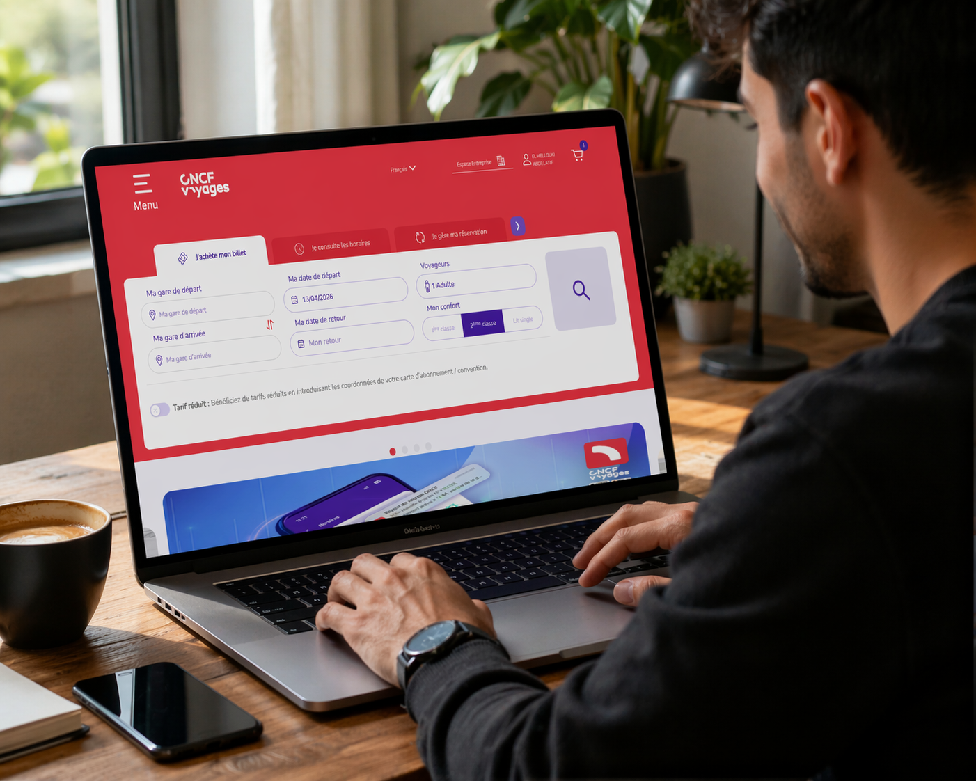
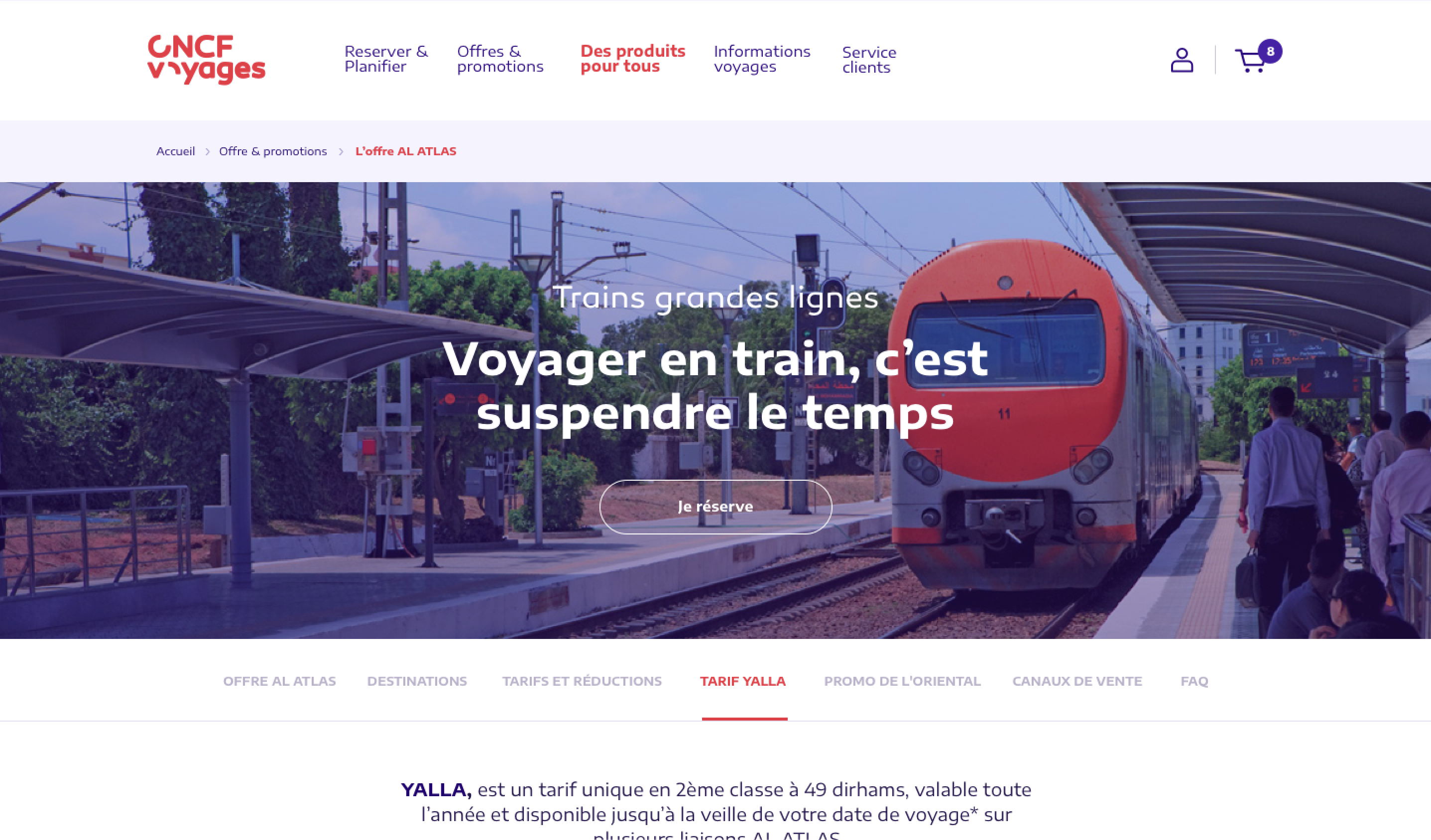
ONCF Voyages is a high-traffic platform used daily by thousands of travelers to search, compare, and book train tickets across Morocco.
The challenge was to improve a critical booking journey within strong technical constraints, while maintaining service continuity.
The platform
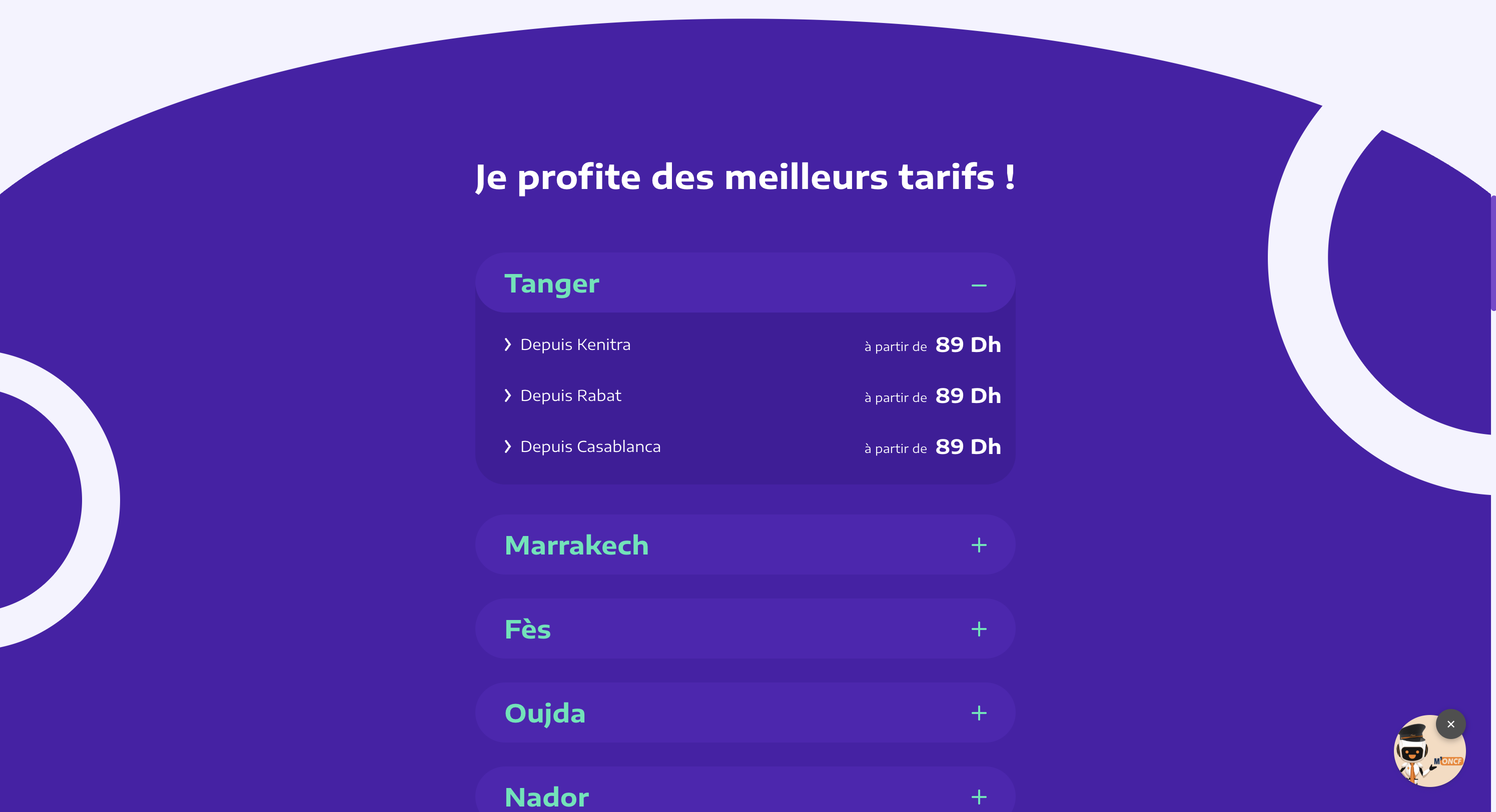
ONCF Voyages is Morocco's primary online railway booking system, connecting millions of travelers daily across the country's rail network.
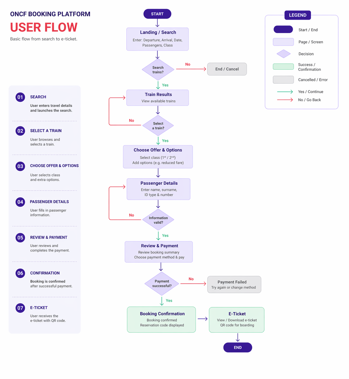
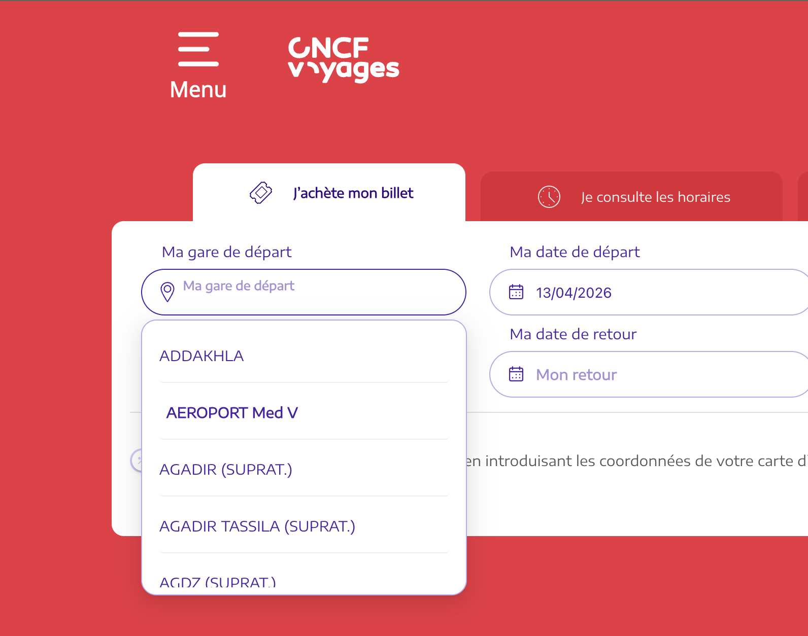
It handles the full booking journey — from search and comparison to payment and ticketing — across both web and mobile platforms.
The Problem
The existing product was shaped by technical constraints rather than user needs. The resulting experience was dense, fragmented, and difficult to navigate — especially on mobile.
Key Issues
- Complex and non-linear booking flow causing drop-offs
- Poor information hierarchy making train comparison difficult
- High cognitive load on mobile devices
- Legacy constraints limiting design decisions
Opportunity
Redesign the booking experience around how travelers actually think — making it fast, clear, and confidence-inspiring without disrupting an existing service.
Objective
Deliver a cleaner, more intuitive booking journey that reduces friction at every decision point and scales across both web and mobile.
Key Decisions
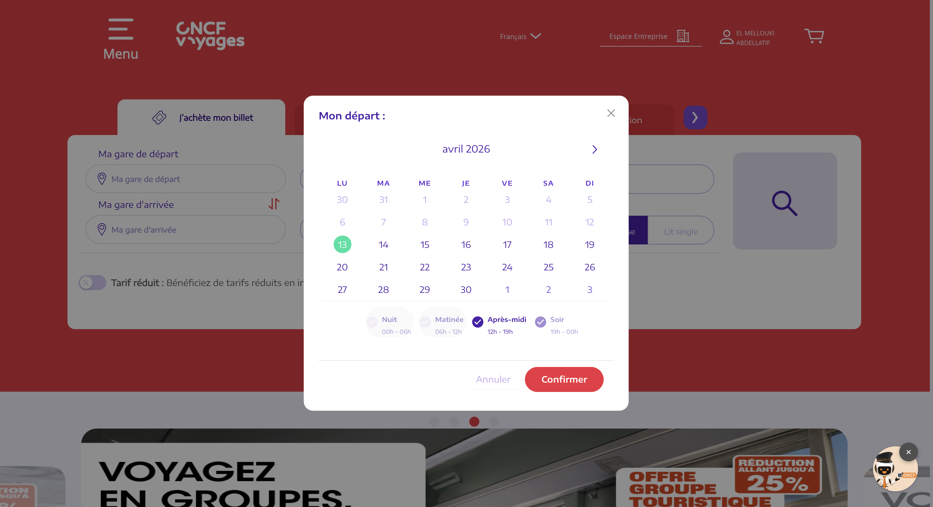
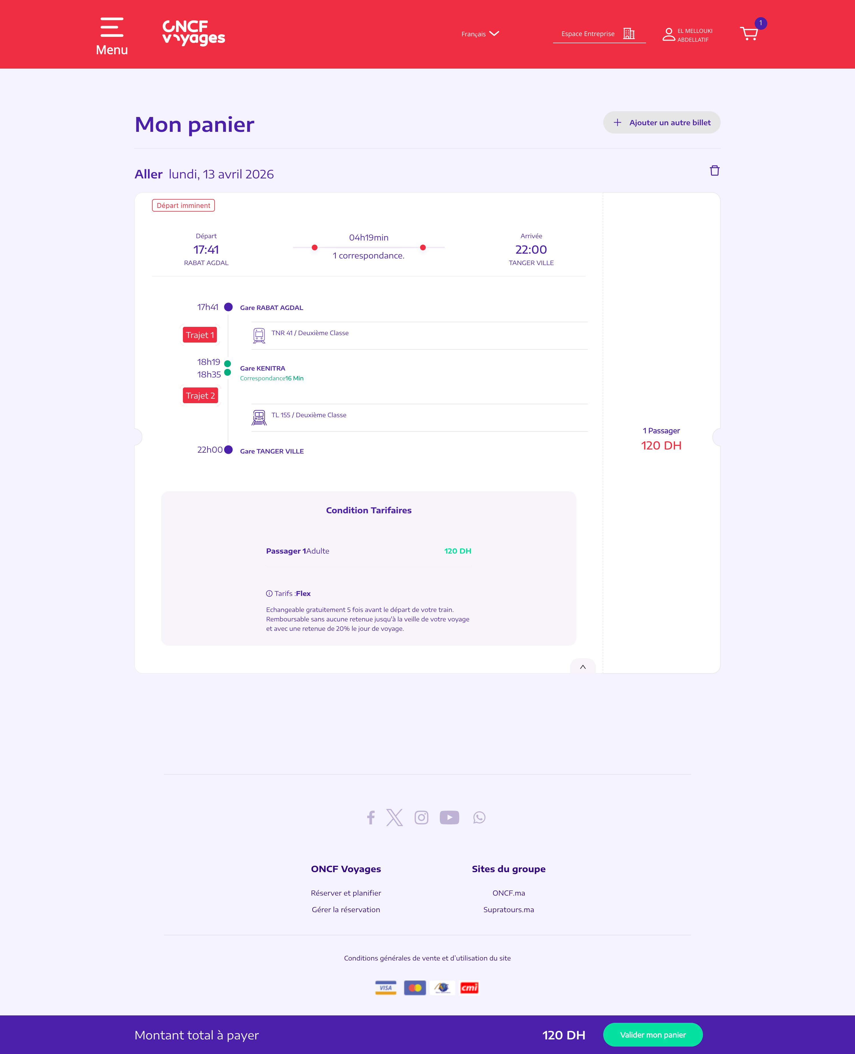
Simplifying the Booking Flow
Decision
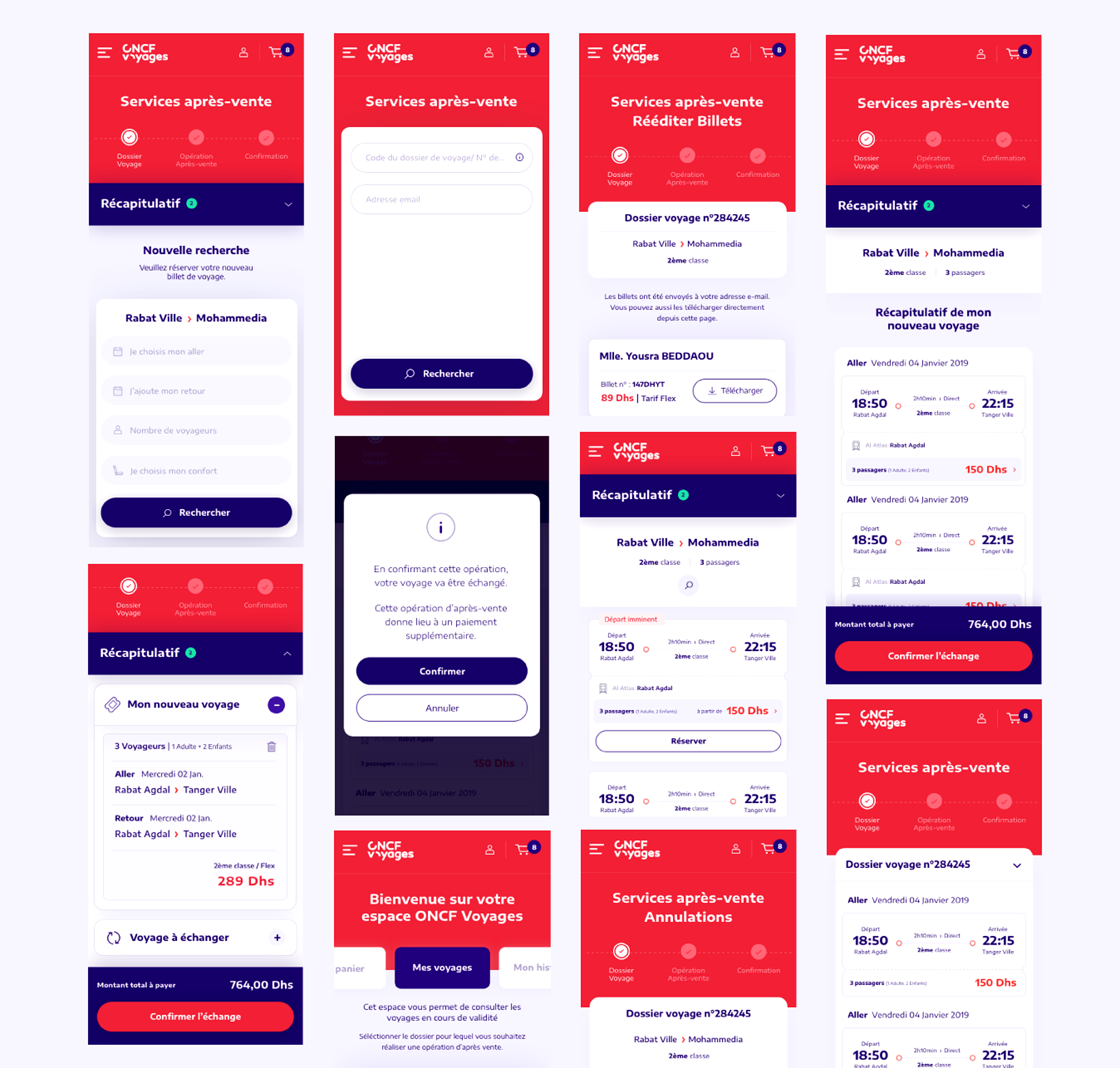
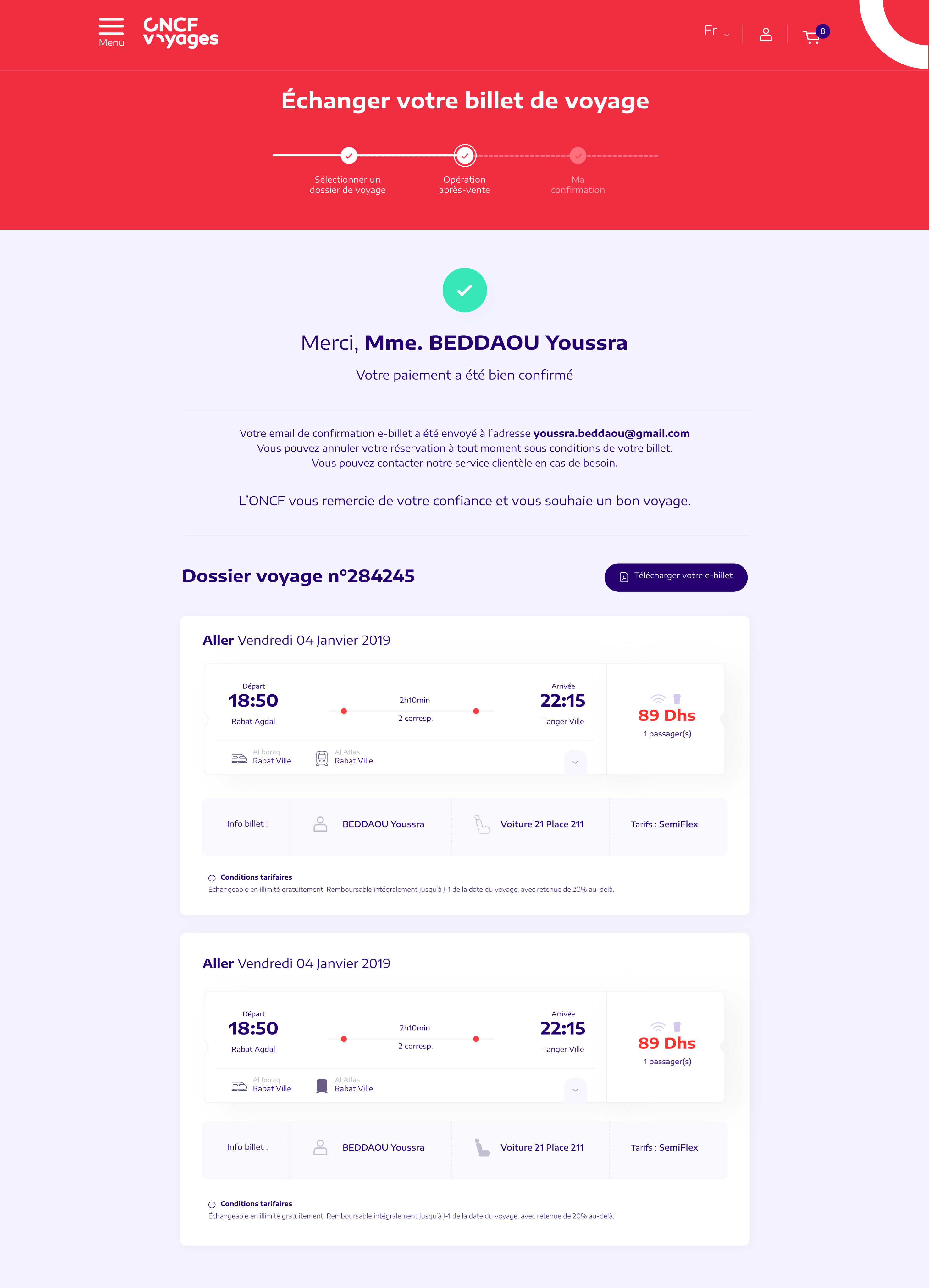
Restructured the journey into sequential, clearly delimited steps with explicit progress indication.
Why
Users frequently abandoned mid-flow due to unclear navigation and non-linear step logic.
Impact
- Reduced friction at key decision points
- Clearer sense of journey progress
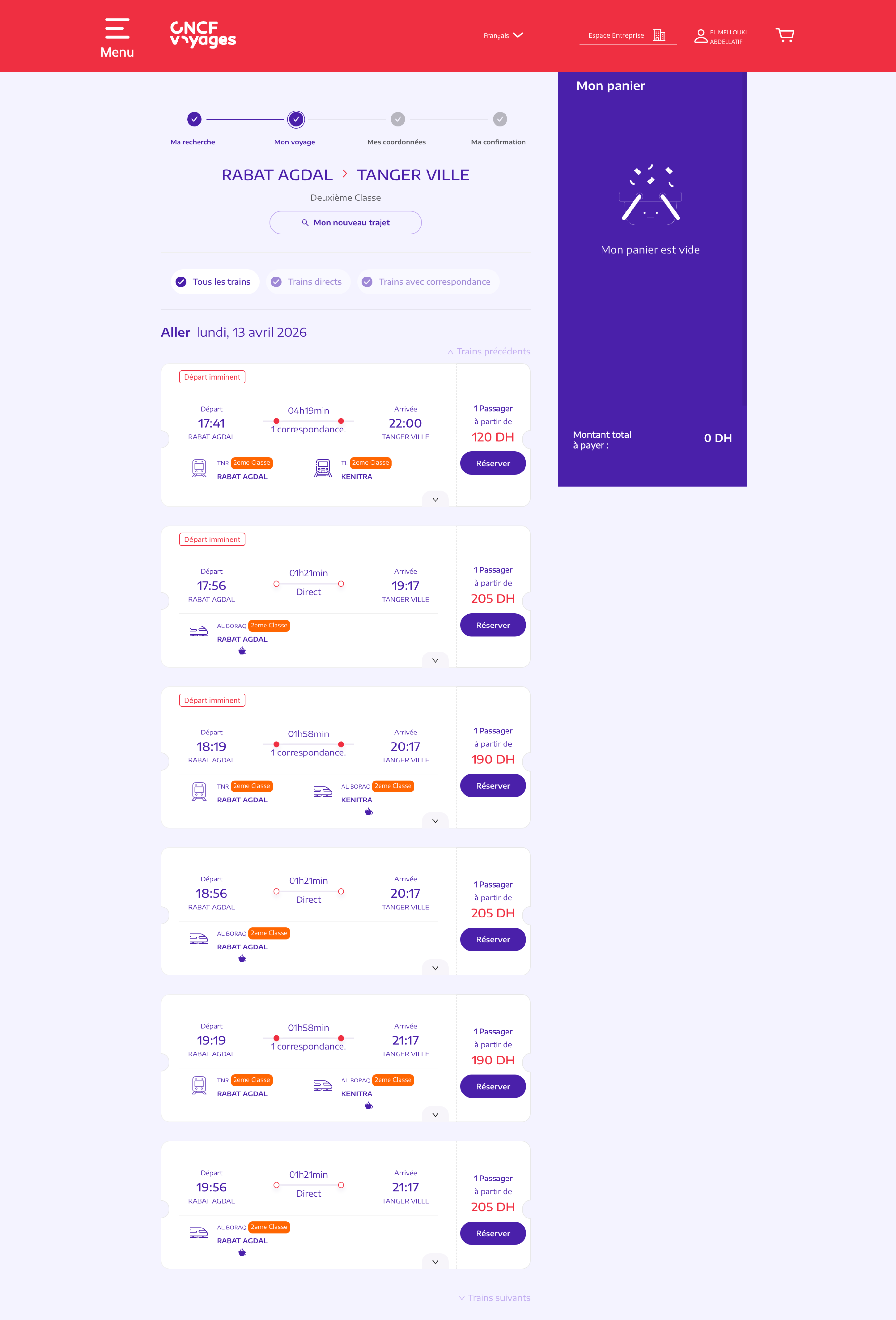
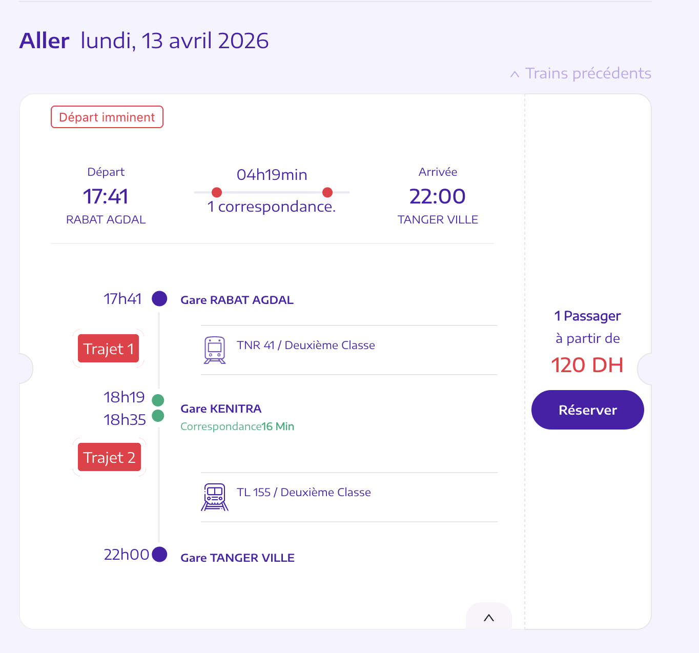
Redesigning Information Hierarchy
Decision
Reorganized train result cards to surface schedule, pricing, and class information at a glance.
Why
Comparing options was slow and frustrating — critical data was buried and poorly grouped.
Impact
- Faster scanning and comparison
- Improved decision confidence
Designing for Mobile First
Decision
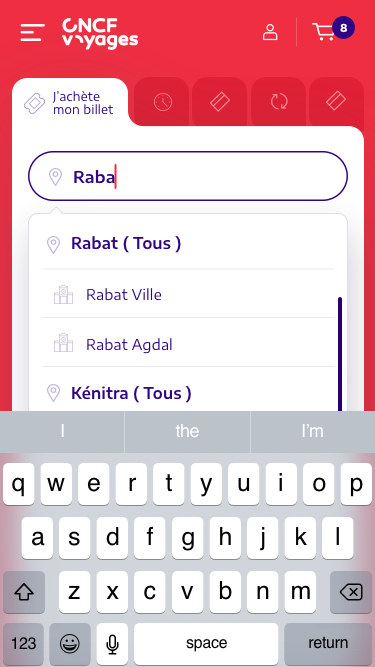
Rebuilt the booking flow for small screens with larger touch targets and reduced form complexity.
Why
A significant share of users booked on mobile with noticeably higher drop-off rates.
Impact
- Lower cognitive load on mobile
- Reduced form errors and abandonment
The process
Research → Wireframes → UI
Starting from a full flow audit and user journey mapping, we identified where users dropped off and why before designing any solutions.
Wireframes validated flow logic with stakeholders early — keeping structural and aesthetic decisions separate and reducing costly rework at the UI stage.
The impact
- Improved readability and faster information scanning
- Reduced cognitive load during booking
- More efficient booking experience for repeat users
- Established a scalable UX/UI foundation for future product evolution